Layouts
Builtin layouts
By default, the following layouts are provided:
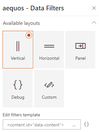
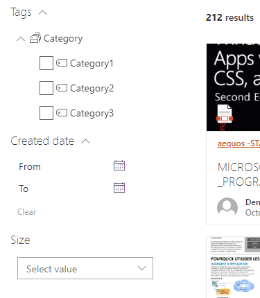
Vertical
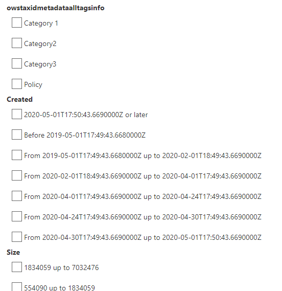
Display filters as a vertical bar:
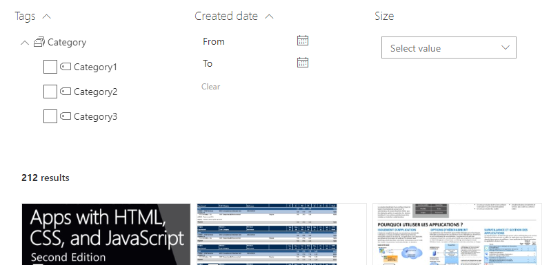
Horizontal
Display filters as an horizontal bar. For instance, it fits nicely with 'Combo' filter templates.
Layout options
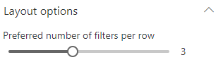
| Setting | Description | Default value |
|---|---|---|
| Preferred number of cards per row | Specifiy the preferred number of filters to display per row when the required width space is available. The Web Part will always adjust the number of possible filters to display depending the available width. It means that if you set this value to '3' but you display the Web Part in small column, only 1 filter will be displayed. | 3. |
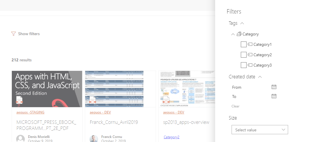
Panel
Display filters as an side panel. Useful to gain space on the page.
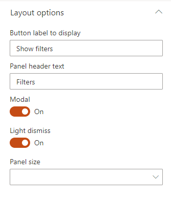
Layout options
| Setting | Description | Default value |
|---|---|---|
| Button label to display | The label to display to open the panel. | "Show filters". |
| Panel header text | The label to display to in the panel header. | "Filters". |
| Modal | If enabled, the panel will be modal (you can't select elemtns outside the panel). | True |
| Light dismiss | If enabled, dismiss the panel when click outside. | True |
| Panel size | The filter panel size to display. | Small (right). |
Debug
The 'debug' layout allows you to see all relevant data used by filter templates during render.
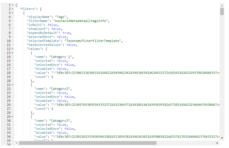
The template context object exposes the following properties:
{
    "filters": "<Current filters to display in the UI (selected/unseslected)>",
    "selectedFilters": "<The current submitted filters>",
    "instanceId": "<The Web Part instance ID>",
    "theme": "<Current theme variables>",
    "strings": "<Localized strings that can be used in the Web Part>",
    "selectedOnce": "<Flag indicating if a filter value has been selected at least once by the use>",
    "properties": "<The filter Web Part properties>"
}
Custom
The 'custom' layout is the minimal layout to start with if you want to create your own customized UI from scratch. You can also start from an existing layout.
Updating a builtin layout (ex: 'Horizontal', 'Vertical', etc.) will automatically switch the selected layout to 'Custom' with your modifications as content. All previous custom layout content will be overwritten.
You have also the ability to use an external .html file to centralize your customizations. This file must be stored in an accessible location for uses (ex: a SharePoint document library with 'Read' permissions for concerned users).
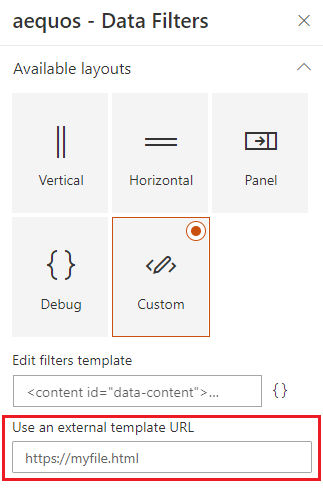
Unless you specify an external file, the template content is stored in the Web Part property bag.
Updating the layout HTML template is a good option for minor UI updates (Ex: add a link, update colors, etc.). For more control over the UI, you may want to use the extensibility library feature.