Builtin web components
Here are the list of all reusable web components you can use to customize your templates.
- <aequos-iconfile>
- <aequos-documentcard>
- <aequos-filepreview>
- <aequos-icon>
- <aequos-panel>
- <aequos-collapsible>
- <aequos-persona>
- <aequos-sortfield>
Info
All other web components you will see in builtin layout templates are considered internal and are not supported for custom use.
All components have an optional data-theme-variant attribute used to set the theme for your internal React components (for instance using Office UI Fabric). This value is typically retrieved from the root Handlebars context and reflect the current section theme where the Web Part belongs. If not set, the theme of current site will be used as fallback and may not corespond to the current section theme.
Icon file
Example
Render a file icon according to an extension.
<aequos-iconfile
    data-extension="docx"
    data-is-container="false"
    data-size="32">
</aequos-iconfile>
| Parameter | Description |
|---|---|
| data-extension | The file extension to render. |
| data-is-container | If true or 1, the icon will be a folder. |
| data-size | The size of the icon to display. |
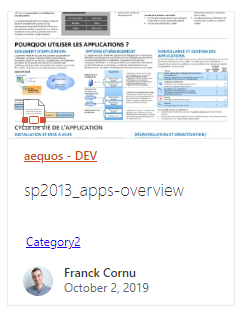
Document card
Example
Render a document card.
<aequos-documentcard
data-location="<a href=\"https://...\">Title</a>"
data-title="Title"
data-preview-image="https://..."
data-preview-url="https://..."
data-date="01/01/2020"
data-href="https://..."
data-author="David Lopez"
data-profile-image="/_layouts/15/userphoto.aspx?size=L&username=david.lopez@contoso.com"
data-file-extension="docx"
data-enable-preview="true"
data-is-container="false"
data-show-file-icon="true">`
</aequos-documentcard>
| Parameter | Description |
|---|---|
| data-location | The document card location. HTML is allowed here. You must encode the string for this scenario. |
| data-title | The document card title. |
| data-preview-image | The preview image URL for the card. |
| data-preview-url | The preview URL for the card. |
| data-href | The URL for the card title. |
| data-author | The author to display. |
| data-profile-image | The profile image URL for the author if any. |
| data-file-extension | The document card file extension if any. |
| data-enable-preview | If the card supports preview. If true, a preview URL + preview image URL should be set. |
| data-is-container | If true or 1, the file icon will be a folder icon. |
| show-file-icon | If true or 1, the file icon will be hidden/displayed. |
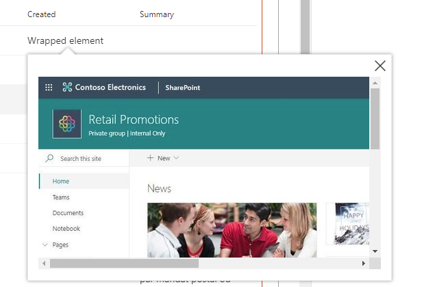
File preview
Example
Render file preview in a callout when the wrapped element is clicked. The wrapped element can be anything (text, image, etc.)
<aequos-filepreview
    data-preview-url="https://..."
    data-preview-image-url="https://...">
    <span>Wrapped element</span>
</aequos-filepreview>
| Parameter | Description |
|---|---|
| data-preview-image | The preview image URL for the callout displayed while the preview is loading in a iframe (optional). |
| data-preview-url | The preview URL for the element in the callout. |
Icon
Example
Display an Office UI Fabric icon.
<aequos-icon data-name="Tag" aria-hidden="true"></aequos-icon>
| Parameter | Description |
|---|---|
| data-name | The Office UI Fabric icon name to display (case sensitive). |
Panel
Example
Display a panel with (panel-content) content when the associated outer panel-open element is clicked.
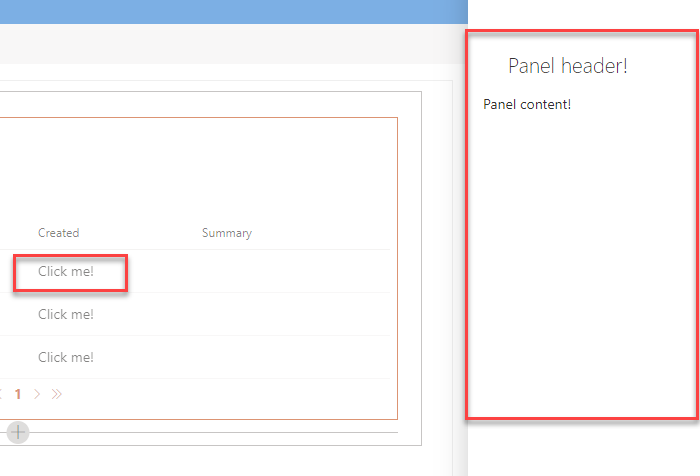
<aequos-panel
    data-state-key="{{@root.instanceId}}"
    data-disable-animation="true"
    data-is-light-dismiss="true"
    data-is-blocking="true"
    data-size="2"
    data-panel-header-text="Panel header!">

    <template id="panel-open">
        <!-- All the content here will be wrapped with an onclick event opening/hiding the panel -->

        Click me!
    </template>

    <template id="panel-content">
        <!-- Panel content goes here -->

        Panel content!
    </template>

</aequos-panel>
| Parameter | Description |
|---|---|
| data-state-key | An unique ID for the panel component. This value is used to store the current open state. You can use any value here or a unique ID coming from the contexte like {{@root.instanceId}} |
| data-disable-animation | Disable the panel opne/close animation. |
| data-is-light-dismiss | If true, dismiss the panel when the user clicks outside of the panel area. |
| data-is-blocking | If true, the modal show as modal. |
| data-size | The size of the panel. See Office Fluent UI for valid values. |
| data-theme-variant | The current Microsoft 365 them. Itended to work with {{JSONstringify @root.theme}}. |
| data-panel-header-text | The header text in the panel. |
Important
Since release 1.3.0 the parameter data-is-open is deprecated.
Collapsible
Example
Expand/collapse the collapsible-content content when the text with data-group-name is clicked.
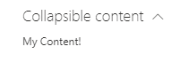
<aequos-collapsible
    data-group-name="Collapsible content"
    data-default-collapsed="true">

    <template id="collapsible-header">
        <div>
            My header!
        </div>
    </template>

    <template id="collapsible-content">
        <div>
            My Content!
        </div>
    </template>

    <template id="collapsible-footer">
        <div>
            My Footer!
        </div>
    </template>

</aequos-collapsible>
| Parameter | Description |
|---|---|
| data-default-collapsed | If the content should be collapsed by default true/false. |
| data-group-name | The header group name for expand/collapse. |
Persona card
Example
Display a persona item with relevant information.

<aequos-persona
    data-image-url="/_layouts/15/userphoto.aspx?size=L&username=david.lopez@contoso.com"
    data-primary-text="David Lopez"
    data-secondary-text="Unknown"
    data-tertiary-text=""
    data-optional-text="514 928 0000"
    data-persona-size="" >
</aequos-persona>
| Parameter | Description |
|---|---|
| data-image-url | The persona image URL. |
| data-primary-text | The primary text (ex: person display name). |
| data-secondary-text | The secondary text to display (ex: job title). |
| data-tertiary-text | The tertiary text to display (ex: work phone). |
| data-optional-text | The optional text to display. |
| data-persona-size | The size of the persona item to display (no only the picture). Valid values are
|
Sort Field
Example
Render a sort dropdown to sort the data results.
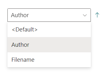
<aequos-sortfield
    data-fields='["Author","Filename"]'
    data-default-selected-field="Author"
    data-default-direction="1">
</aequos-sortfield>
| Parameter | Description |
|---|---|
| data-fields | The array of Sort fields. |
| data-default-selected-field | The default sort field. |
| data-default-direction | If 1, the default direction will be ascending, if 2, it will be descending. |
| data-theme-variant | The current Microsoft 365 theme. Itended to work with {{JSONstringify @root.theme}}. |
For SharePoint and Microsoft data sources, only below Sortable fields are allowed.
'AADObjectID', 'Author', 'ClassificationLastScan', 'ClickStreamClickedCount', 'ClickStreamLastClickCount', 'ClickStreamSkippedCount', 'ClickStreamSkippedCount', 'CommunityMembersCount', 'CommunityRepliesCount', 'CommunityTopicsCount', 'ComplianceTag', 'ComplianceTagWrittenTime', 'Created', 'DMSDocAccessRight', 'DMSDocAuthor', 'DMSDocTitle', 'DetectedLanguageRanking', 'DocumentAnalyticsLastActivityTimestamp', 'DocumentAnalyticsLastActivityTimestamp', 'EndDateOWSDATE', 'EventDateOWSDATE', 'EventRate', 'EventsRollUpEndDate', 'EventsRollUpStartDate', 'ExpirationTime', 'FileExtension', 'Filename', 'FirstName', 'FirstPublishedDate', 'IRMProtected', 'IRMTemplateName', 'InboundLinkCount', 'IsExternalContent', 'LastModifiedTime', 'LastModifiedTimeForRetention', 'LastName', 'LevelsToTop', 'ModifiedBy', 'ModifierAADIDs', 'NonWordBrokenComplianceTag', 'ProductCatalogGroupNumberOWSTEXT', 'PromotedState', 'QLogClicks', 'QLogLastClicks', 'QLogSiteClicks', 'QLogSiteLastClicks', 'QLogSiteSkips', 'QLogSkips', 'RecentViewCount', 'RecentViewCount', 'RecsClickedLifeTime', 'RecsClickedRecent'.